quick answer
The best fonts for labels have plain, open letters in a medium weight, a tall x-height and a little extra letter spacing. Print them in dark ink on a light background, and size the main word so you can read it from where you usually stand. Test one label before you print the whole sheet.
Level: easy
You will need: removable label sheets, a home printer, jars or bins to label, a ruler or tape measure
You label a jar, step back, and still can’t tell if it says rice or rye. The problem is rarely your printer or your handwriting. It’s usually the font. The best fonts for labels are plain and sturdy, and they stay readable from a few feet away.
A label font is easy to read when its weight, letter shapes, x-height, spacing, contrast and size all work together. Test one label before you print a whole sheet, and use removable labels so you can swap the font if your first pick fails. For a ready-made set, try our free printable pantry labels.
in this guide
- Start with a medium weight
- Choose plain, open letter shapes
- Look for a tall x-height
- Add a little letter spacing
- Use dark text on a light background
- Size the main word for your viewing distance
- Skip fancy scripts for the main word
- Make the date the clearest text on the label
- Print on removable labels and test one first
Start with a medium weight
Weight is how thick the strokes of the letters are. Very thin fonts fade into the label from a distance. Very heavy ones can fill in the little gaps inside letters like e and a.
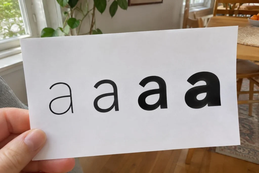
A medium or semi-bold weight usually reads best. If your font comes in more than one weight, print the word in regular and bold side by side. Pick the one where each letter still looks separate when you step back.
Choose plain, open letter shapes
Open letters have clear gaps in shapes like c, e and s. A simple sans-serif or a sturdy slab style with blocky, even strokes is a safe pick for the main word. Both keep letters distinct on small labels.
Check for look-alikes. In some fonts, a capital I and a lowercase l match, and a zero looks like an O. Type a few real labels, such as “Oil 1 L” or “Oats”, and make sure nothing can be misread.
Look for a tall x-height
The x-height is the height of lowercase letters like x, without the parts that reach up or down. In a font with a tall x-height, lowercase words look bigger at the same point size. That helps on small jar labels.
To compare, type the same word in a few fonts at the same size, such as “flour”. The font where the lowercase letters look largest and the word still fits is usually the winner.
snug tip
Type the same word in each font you like and print them on one page. Seeing them side by side shows right away which one reads biggest and clearest.
Add a little letter spacing
Letters that sit too close blur together when you view them from a distance. A small increase in spacing, often called tracking or character spacing, makes words easier to pick out.
Most label and word-processing programs have this setting. Nudge it up a notch or two, then look for trouble spots like r and n running into an m. Too much spacing breaks the word apart, so stop as soon as it looks even.
Use dark text on a light background
Contrast is the difference between the text and what’s behind it. Black or very dark navy on white or pale cream is the easiest to read. Pale gray, pastels and yellow text tend to disappear.
If you stick labels on clear jars, choose labels with a solid light background. Text on see-through stickers gets lost against the food behind it. Light text on a dark label can work, but use a heavier weight and test it first.
Size the main word for your viewing distance
Measure the distance from your usual spot to the shelf. Labels on a shelf you reach into can be smaller than labels on a high shelf or across the room.
Letters about half an inch tall are usually enough for a jar at arm’s length. Go larger for anything farther away. Print one test label, stick it on, and step back to your normal spot. If you squint, raise the size.
snug tip
Check your test label in the light you actually use. A label that looks fine at noon can be hard to read under a dim kitchen light at night.
Skip fancy scripts for the main word
Script and decorative fonts have thin joins, swirls and tight loops. They look nice up close, but they are hard to read fast, especially in dim kitchen light.
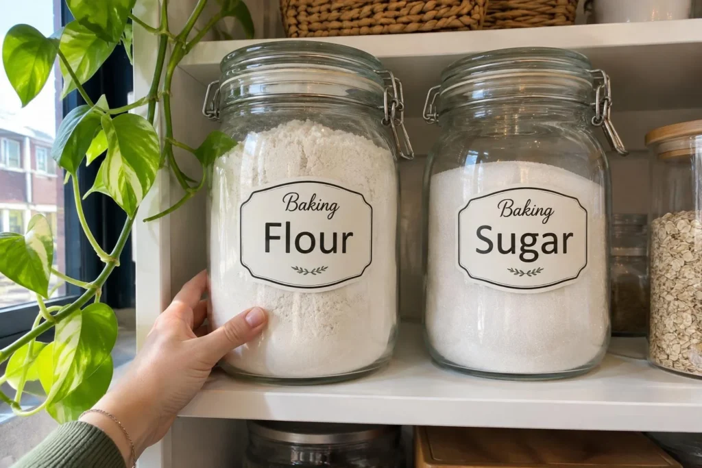
Use one plain font for the main word. If you want some style, save a decorative font for a small extra word, like a category. Stick to two fonts at most so shelves look calm instead of busy.
Make the date the clearest text on the label
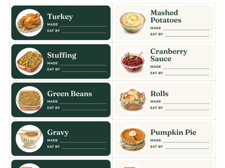
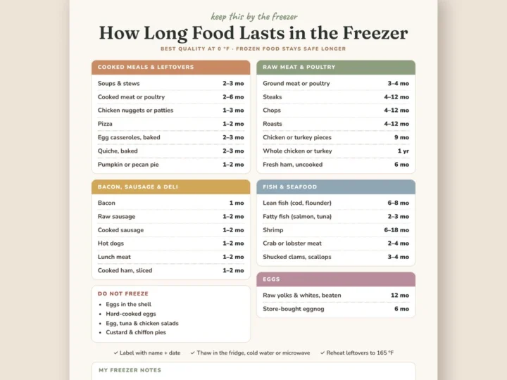
Dates matter more than decoration, so make the date the easiest thing to read on freezer bags and leftover containers.
Use a plain, medium-weight font with clear numbers. Write the month as letters, like “Mar 4”, so nobody has to guess between 3/4 and 4/3. Put the date on its own line, set slightly apart from the food name.
Learn more: USDA: Leftovers and Food Safety
Print on removable labels and test one first
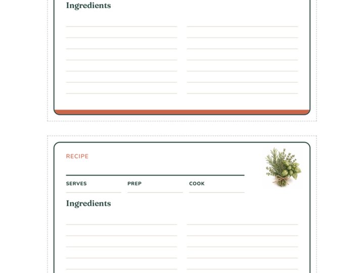
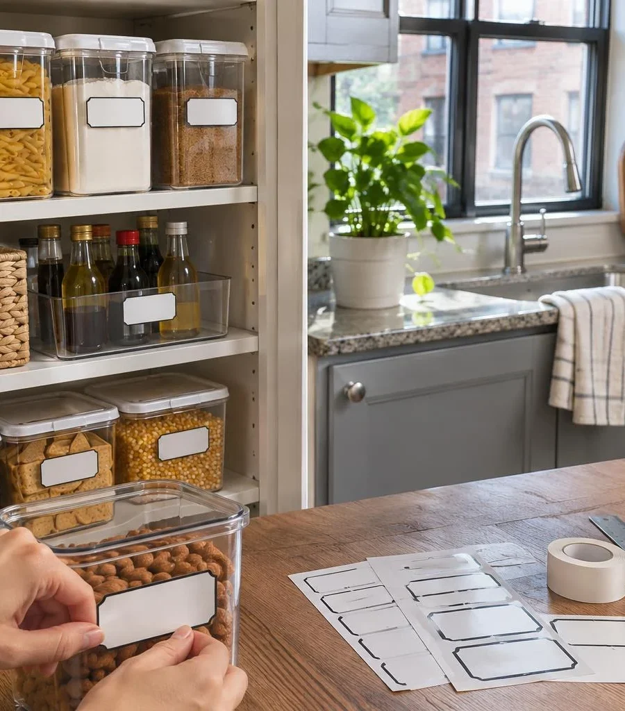
Removable labels let you change your mind about the font, size or wording without a sticky mess. They work well on jars, bins, baskets and the front of drawers.
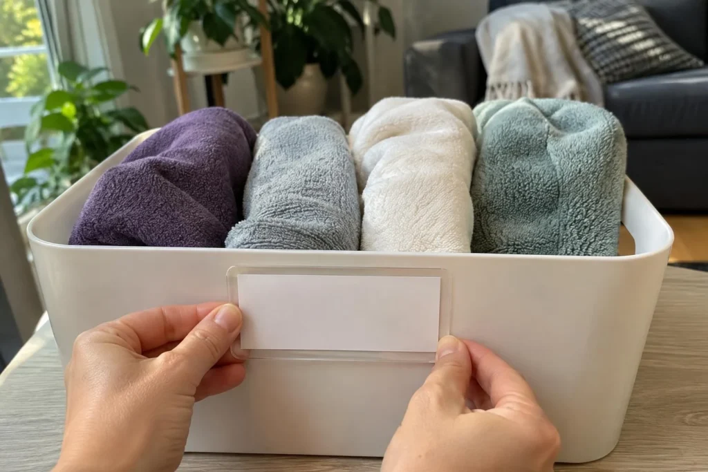
Print a single test label with your top two fonts on one sheet. Stick it on a jar, step back, and see which one you can read faster. Then print the full set of the winner.
Shop the idea: removable label sheets on Amazon (for example, Avery)
Renter note: Even removable adhesive can lift paint or a worn finish on walls and cabinet doors. Stick labels on jars and bins, or test a hidden spot first.
from our shop
Want labels that already follow these rules? Our Pantry & Kitchen Labels in black and white use plain, dark type on a light background, with date lines on the freezer labels and fillable blanks for your own words.
Made by us · sold on Creative Fabrica · affiliate link
Where to start
This weekend, pick two plain fonts and print one test sheet. Use three real words you need, like “flour”, “oats” and “Mar 4”. Put them on removable labels.
Stick the test labels on a jar, step back to where you normally stand, and see which one you read faster. Then print the full set with the winner. Our free printable pantry labels are a handy starting point.
free printable checklist
Easy-to-Read Label Checklist
9 steps. Tick them off as you go (your ticks stay on this device), or print it and keep it where you do the job.
The Snug Nook · thesnugnook.com
Quick answers
What is the easiest font to read on a label?
A plain sans-serif in a medium weight is usually the easiest. Look for open letters, a tall x-height and a bit of extra spacing. Check it in your own space, since the best choice depends on how far away you stand.
Should label text be all caps or lowercase?
All caps can work for short words, like “RICE” or “TEA”. Longer words are usually easier to read in sentence case, since the mix of tall and short letters makes each word easier to recognize. Test both with your real labels.
What size should text be on a pantry label?
There’s no single size, because it depends on the jar and how far you stand. For jars you reach into, letters about half an inch tall are usually enough, and farther shelves need larger text. Print one test label and read it from your usual spot.
free for subscribers
Pantry labels that make it stick
Print, cut, stick. Plus occasional small-space tips. Unsubscribe anytime.